Nuxt and Hydration
When developing, you may face hydration issues. Don't ignore those warnings.
Why is it important to fix them?
Hydration mismatches are not just warnings - they are indicators of serious problems that can break your application:
Performance Impact
- Increased time to interactive: Hydration errors force Vue to re-render the entire component tree, which will increase the time for your Nuxt app to become interactive
- Poor user experience: Users may see content flashing or unexpected layout shifts
Functionality Issues
- Broken interactivity: Event listeners may not attach properly, leaving buttons and forms non-functional
- State inconsistencies: Application state can become out of sync between what the user sees and what the application thinks is rendered
- SEO problems: Search engines may index different content than what users actually see
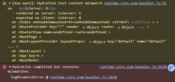
How to detect them
Development Console Warnings
Vue will log hydration mismatch warnings in the browser console during development:
Common reasons
Browser-only APIs in Server Context
Problem: Using browser-specific APIs during server-side rendering.
<template>
  <div>User preference: {{ userTheme }}</div>
</template>

<script setup>
// This will cause hydration mismatch!
// localStorage doesn't exist on the server!
const userTheme = localStorage.getItem('theme') || 'light'
</script>
Solution: You can use useCookie:
<template>
  <div>User preference: {{ userTheme }}</div>
</template>

<script setup>
// This works on both server and client
const userTheme = useCookie('theme', { default: () => 'light' })
</script>
Inconsistent Data
Problem: Different data between server and client.
<template>
  <div>{{ Math.random() }}</div>
</template>
Solution: Use SSR-friendly state:
<template>
  <div>{{ state }}</div>
</template>

<script setup>
const state = useState('random', () => Math.random())
</script>
Conditional Rendering Based on Client State
Problem: Using client-only conditions during SSR.
<template>
  <div v-if="window?.innerWidth > 768">
    Desktop content
  </div>
</template>
Solution: Use media queries or handle it client-side:
<template>
  <div class="responsive-content">
    <div class="hidden md:block">Desktop content</div>
    <div class="md:hidden">Mobile content</div>
  </div>
</template>
Third-party Libraries with Side Effects
Problem: Libraries that modify the DOM or have browser dependencies (this happens a LOT with tag managers).
<script setup>
if (import.meta.client) {
    const { default: SomeBrowserLibrary } = await import('browser-only-lib')
    SomeBrowserLibrary.init()
}
</script>
Solution: Initialise libraries after hydration has completed:
<script setup>
onMounted(async () => {
  const { default: SomeBrowserLibrary } = await import('browser-only-lib')
  SomeBrowserLibrary.init()
})
</script>
Dynamic Content Based on Time
Problem: Content that changes based on current time.
<template>
  <div>{{ greeting }}</div>
</template>

<script setup>
const hour = new Date().getHours()
const greeting = hour < 12 ? 'Good morning' : 'Good afternoon'
</script>
Solution: Use NuxtTime component or handle it client-side:
<template>
  <div>
    <NuxtTime :date="new Date()" format="HH:mm" />
  </div>
</template>
<template>
  <div>
    <ClientOnly>
      {{ greeting }}
      <template #fallback>
        Hello!
      </template>
    </ClientOnly>
  </div>
</template>

<script setup>
const greeting = ref('Hello!')

onMounted(() => {
  const hour = new Date().getHours()
  greeting.value = hour < 12 ? 'Good morning' : 'Good afternoon'
})
</script>
In summary
- Use SSR-friendly composables:
useFetch,useAsyncData,useState - Wrap client-only code: Use
ClientOnlycomponent for browser-specific content - Consistent data sources: Ensure server and client uses the same data
- Avoid side effects in setup: Move browser-dependent code to
onMounted