 @morev/vue-transitions


@morev/vue-transitions
Reusable interface transitions for Vue 2 and Vue 3 with no CSS needed ❤️
✔️ Highly customizable via props;
✔️ Correctly works with grid/flex layouts in group mode;
✔️ Considers initial styles of animated elements such as transform or opacity;
✔️ Even more easy-to-use with universal Nuxt 2 and Nuxt 3 module.
Table of contents:
Installation
❗ Requirements
- Node version:
>= 18.0.0 - Nuxt version (if used):
>= 2.17.0 || >= 3.5.0
The plugin will not work if you are using a Node or Nuxt version less than the specified ones.
Using yarn
yarn add @morev/vue-transitions
Using npm
npm install @morev/vue-transitions
Using pnpm
pnpm add @morev/vue-transitions
Using bun
bun add @morev/vue-transitions
❗ Important note for Bun users
The package relies on postinstall hook to determine the Vue version and provide proper components.
By default, Bun does not execute lifecycle hooks,
so to make it work you need to manually add the package to the trustedDependencies after installing and run bun install again.
{
  "trustedDependencies": ["@morev/vue-transitions"]
}
Usage
You may skip the following paragraphs if you are going to use the library with Nuxt.
Go to "Usage with Nuxt" section.
Package exports two versions of components:
- Version for
Vue2available with named export/vue2 - Version for
Vue3available with named export/vue3
However, there is also a default export mapped to local version of Vue being used.
Underhood, it utilized the postinstall npm hook.
After installing the package, the script will start to check the installed Vue version
and redirect the exports to based on the local Vue version.
It feels pretty robust, but if you're worried about, prefer an explicit named import according to the version you're using.
By the way, you can change default export after installation: just run the command
vue-transitions-version-switch <version>
- Example using
yarn:yarn vue-transitions-version-switch 2- Example using
npx:npx vue-transitions-version-switch 3
Global registration
Using Vue3
import { createApp } from 'vue';
import { plugin as vueTransitionsPlugin } from '@morev/vue-transitions';
import '@morev/vue-transitions/styles';

const app = createApp(App);

app.use(vueTransitionsPlugin({
  // Plugin options (optional, described below)
}));
Using Vue2
import Vue from 'vue';
import { plugin as vueTransitionsPlugin } from '@morev/vue-transitions';
import '@morev/vue-transitions/styles';

Vue.use(vueTransitionsPlugin, {
  // Plugin options (optional, described below)
});
😥 I got an error "This dependency was not found"
For environments that can't resolve exports field (such as Nuxt 2)
just replace styles import with direct path to file:
- import '@morev/vue-transitions/styles';
+ import '@morev/vue-transitions/dist/index.css';
Custom options
It's recommended to use the named export
plugininstead of default export when setting custom options to get proper type information.
Custom options allows to change default property values.
To change the defaults, pass the defaultProps key to the plugin settings, listing the key-value pairs of desired props.
You may also change default props per-component, to do so just pass the componentDefaultProps key to plugin settings.
Important: these props are not validated, so make sure you define them with right values.
import { createApp } from 'vue';
import { plugin as vueTransitionsPlugin } from '@morev/vue-transitions';
import '@morev/vue-transitions/styles';

const app = createApp(App);

app.use(vueTransitionsPlugin({
  // Default duration for all transitions now is `200`
  defaultProps: {
    duration: 200,
  },
  // But for `<transition-expand>` default duration is `500`
  componentDefaultProps: {
    TransitionExpand: {
      duration: 500,
    }
  }
}));
Direct import of components
<template>
  <transition-fade>
    <div v-if="isVisible" class="box">
      Fade transition
    </div>
  </transition-fade>
</template>

<script>
  import { TransitionFade } from '@morev/vue-transitions';

  export default {
    components: { TransitionFade },
  };
</script>
Usage with Nuxt
The library exports a ready-to-use universal module for Nuxt 2 and 3 via named export /nuxt.
Using Nuxt, it's recommended to use the module instead of manual installation because:
- Nuxt allows to auto-import components on demand instead of global registration, which is a more performant option.
- It's just faster to do :)
To use, add @morev/vue-transitions/nuxt to the modules section of your nuxt.config.ts / nuxt.config.js:
export default defineNuxtConfig({
  modules: [
    '@morev/vue-transitions/nuxt',
  ],
  vueTransitions: {
    // The same options as in the plugin itself.
    // You will get an autocomplete using Nuxt 3.
  }
});
Enjoy you transition components! 🎉
IntelliSense
You may skip this section using Nuxt module - it does it for you.
This section only applies to VSCode setup and global registration of components.
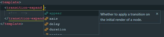
With Vue 2
Using Vue 2 with Vetur extension installed all components should provide hints as it, no actions required:
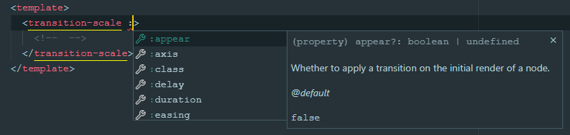
With Vue 3
Using Vue 3 with Volar extension installed all components should provide hints as it, no actions required:
List of transitions
TransitionFade
Basic transition that changes element opacity. Pretty simple.
Show code
<template>
  <transition-fade>
    <div v-if="isVisible">...</div>
  </transition-fade>
</template>

<script>
  import { TransitionFade } from '@morev/vue-transitions';

  export default {
    components: { TransitionFade },
  };
</script>
TransitionExpand
Transition that manipulates with actual element size.
If you are old enough you may know this transition as jQuery slideUp/slideDown.
It also can work with X axis like slideLeft and slideRight
(although it's hard for me to come up with a scenario where it will really be needed).
Has unique prop: axis
TransitionSlide
Transition that manipulates with element position via transform: translate().
It requires offset prop to calculate desired element position and can work with percentage values.
Examples how to work with offset prop
<template>
  <!--
    Element will fade in and fade out to top.
    Initial transform is `transform: translate(0, -16px)`
  -->
  <transition-slide :offset="[0, -16]"></transition-slide>

  <!--
    Element will fade in and fade out to bottom left side.
    Initial transform is `transform: translate(-16px, 16px)`
  -->
  <transition-slide :offset="[-16, 16]"></transition-slide>

  <!--
    Element will fade in and fade out to right,
    and the offset will be relative to the element width itself.
    Initial transform is `transform: translate(100%, 0)`
  -->
  <transition-slide :offset="['100%', 0]"></transition-slide>

  <!--
    Element will fade in from top and fade out to bottom,
    and the offset will be relative to the element height itself.

    Transform before element appears: `transform: translate(0, -100%)`
    Transform when element disappears: `transform: translate(0, 100%)`
  -->
  <transition-slide
    :offset="{
      enter: [0, '-100%'],
      leave: [0, '100%']
    }"
  ></transition-slide>
</template>
It respects the transform applied to element itself via CSS and merges it with defined offset.
It's very useful, for example, when you are trying to make centered dropdown.
👀 Show example of `transform` merging
<template>
  <div class="block">
    <!--
      In this case, given the CSS styles,
      initial transform will be calculated to `translate(-50%, -16px)`
    -->
    <transition-slide :offset="[0, -16]">
      <div class="block__dropdown" v-if="isVisible">
        ...
      </div>
    </transition-slide>
  </div>
</template>

<style>
  .block {
    position: relative;
  }

  .block__dropdown {
    position: absolute;
    top: 100%;
    left: 50%;
    transform: translateX(-50%);
  }
</style>
Has unique prop: offset
TransitionScale
Transition that manipulates with element transform: scale().
By default, it scales element from scale(1) to scale(0), but this behavior can be customized via :scale prop.
It works with different axis via axis prop.
Has unique props: scale, axis, origin
Show example of code
<template>
  <!--
    This element appears in `x` axis and disappears in `y`
  -->
  <transition-scale :axis="{ enter: 'x', leave: 'y' }"></transition-scale>

  <!--
    This element behaves like the `transition-expand`,
    but touches only `transform` property
  -->
  <transition-scale transform-origin="50% 0%"></transition-scale>

  <!--
    This element scales just a little when fading in/out.
  -->
  <transition-scale :scale=".8"></transition-scale>

</template>
Props
Common props
Those properties are related to each transition:
group
Whether the component should be a transition-group component.
export type TransitionGroup = boolean; // Default: false
Example:
<template>
  <div>
    <!--
      To animate a list of items, use `group` prop.
      ⚠️ Don't forget you should pass the `:key` to each item in this case.
    -->
    <transition-fade group>
      <div v-for="item in items" :key="item.id">...</div>
    </transition-fade>
  </div>
</template>
tag
Transition tag, in the case of using a transition-group component.
export type TransitionTag = string; // Default: 'span'
Example:
<template>
  <div>
    <!--
      Passing the tag renders transition component with it.
      It's suitable, for example, for rendering semantic lists:
    -->
    <transition-fade group tag="ul">
      <li v-for="item in items" :key="item.id">...</li>
    </transition-fade>

    <!-- ✨ Rendered HTML: -->
    <ul>
      <li>...</li>
      <li>...</li>
    </ul>
  </div>
</template>
appear
Whether to apply a transition on the initial render of a node. Acts literally the same as original Vue transition appear prop
export type TransitionAppear = boolean; // Default: undefined
Example:
<template>
  <div>
    <!--
      This element appears when mounted if `isVisible` is `true` by default.
    -->
    <transition-fade appear>
      <div v-if="isVisible">...</div>
    </transition-fade>
  </div>
</template>
mode
export type TransitionMode = 'in-out' | 'out-in' | undefined; // Default: undefined
Example:
<template>
  <div>
    <!--
      Current element transitions out first, then when complete,
      the new element transitions in.
    -->
    <transition-slide mode="out-in">
      <component :is="currentComponent">...</component>
    </transition-slide>
  </div>
</template>
duration
Transition animation duration, ms.
If an object given then enter and leave values will be used for enter and leave transition respectively.
// Default: 300
export type TransitionDuration = number | { enter: number, leave: number }
Example:
<template>
  <div>
    <!--
      If single value provided, the passed amount of milliseconds
      applied to enter and leave animations both.
      This element will appear and disappear within 500ms:
    -->
    <transition-fade :duration="500">
      <div v-if="isVisible">...</div>
    </transition-fade>

    <!--
      If an object given, it SHOULD have `enter` and `leave` keys.
      This element appears in 200ms and disappears within 500ms:
    -->
    <transition-fade :duration="{ enter: 200, leave: 500 }">
      <div v-if="isVisible">...</div>
    </transition-fade>
  </div>
</template>
move-duration
Duration of animation of elements positions changing, in the case of using a transition-group.
Although Vue does not have a native way to set the duration of the move animation via props, this task can be done using CSS Custom Properties.
👀 Show explanation
<!-- This way it can be set dynamically -->
<div style="--move-duration: 300ms;">
  <div class="scale-move"></div>
  <div class="scale-move"></div>
</div>
```

```css
.scale-move {
  transition-duration: var(--move-duration, 300ms);
}
```

</details>

```ts
// Default: 300
export type TransitionMoveDuration = number;
delay
Transition animation delay, ms.
If an object given then enter and leave values will be used for enter and leave transition respectively.
// Default: 300
export type TransitionDelay = number | { enter: number, leave: number };
Example:
<template>
  <div>
    <!--
      If single value provided, then enter and leave animations will wait
      for given amount of milliseconds before run.
      This element will appear and disappear 100ms after
      `isVisible` property changes:
    -->
    <transition-fade :delay="100">
      <div v-if="isVisible">...</div>
    </transition-fade>

    <!--
      If an object given, it SHOULD have `enter` and `leave` keys.
      This element appears immediately and disappears 200ms after
      `isVisible` property changes:
    -->
    <transition-fade :duration="{ enter: 0, leave: 300 }">
      <div v-if="isVisible">...</div>
    </transition-fade>
  </div>
</template>
easing
Transition animation easing. Should be a valid CSS transition timing function.
If an object given then enter and leave values will be used for enter and leave transition respectively.
export type TransitionEasing = string; // Default: 'cubic-bezier(.25, .8, .5, 1)'
Example:
<template>
  <div>
    <!--
      If single value provided, then enter and leave animations will use it:
    -->
    <transition-fade easing="ease-out">
      <div v-if="isVisible">...</div>
    </transition-fade>

    <!--
      If an object given, it SHOULD have `enter` and `leave` keys.
      This element uses custom animation known as `bounce-in` for entering
      and simple `ease-out` curve for leaving:
    -->
    <transition-fade
      :easing="{
        enter: 'cubic-bezier(0.6, 0, 0.4, 2)',
        leave: 'ease-out'
      }"
    >
      <div v-if="isVisible">...</div>
    </transition-fade>
  </div>
</template>
no-opacity
Whether to not animate the element opacity.
By default, each transition manipulates opacity in addition to the main property.
However, sometimes this is not required - for example, when implementing modal panels that appear from the edge of the screen.
The prop is obviously not applicable to
transition-fadecomponent.
export type TransitionNoOpacity = boolean; // Default: false
Example:
<template>
  <div>
    <!--
      This panel appears from the right edge of the screen,
      while its transparency remains unchanged.
    -->
    <transition-slide :offset="['100%', 0]" no-opacity>
      <div class="panel" v-if="isVisible">...</div>
    </transition-slide>
  </div>
</template>

<style>
  .panel {
    position: fixed;
    top: 0;
    right: 0;
    bottom: 0;
    background: #ffffff;
    width: 400px;
  }
</style>
no-move
Whether to not animate elements positions changing, in the case of using a transition-group.
By default, when using group mode, when an element is removed, the remaining elements smoothly change their position.
They are given absolute positioning and dropped out of the flow, so the parent container collapses in height.
Usually this is not a problem, but sometimes - for example, when using transition-expand and
sequentially placed elements under each other, it looks rough.
With this option, you can achieve a more pleasant behavior of the elements in this situation.
export type TransitionNoMove = boolean; // Default: false
Example:
<template>
  <div>
    <!--
      In this case, the height of the parent element (`ul`) changes smoothly.
    -->
    <transition-expand group no-move tag="ul">
      <li v-for="item in items" :key="item.id">...</li>
    </transition-expand>
  </div>
</template>
Unique props of TransitionExpand
axis
Axis by which the element should expand.
If an object given then enter and leave values will be used for enter and leave transition respectively.
type ExpandAxisValue = 'x' | 'y'; // Default: 'y'
export type TransitionExpandAxis = ExpandAxisValue | { enter: ExpandAxisValue, leave: ExpandAxisValue }
Unique props of TransitionSlide
offset
The element offset by x and y axis before/after the transition.
Should be an integer or a string representation of percentage value (e.g. '100%').
Number values treats as px offset, string values ending with % sign treats as percentage of the element width / height.
Examples and explanation
If an object given then enter and leave values will be used for enter and leave transition respectively.
type SlideOffsetValue = [number | string, number | string];

// Default: [0, -16]
export type TransitionSlideOffset = SlideOffsetValue | { enter: SlideOffsetValue, leave: SlideOffsetValue }
Unique props of TransitionScale
axis
Scale axis to be animated.
* `both` (uses `transform: scale()`)
* `x` (uses `transform: scaleX()`)
* `y` (uses `transform: scaleY()`)
If an object given then enter and leave values will be used for enter and leave transition respectively.
type ScaleAxisValue = 'x' | 'y' | 'both';

// Default: 'both'
export type TransitionScaleAxis = ScaleAxisValue | { enter: ScaleAxisValue, leave: ScaleAxisValue }
origin
transform-origin CSS property applied to element(s). \
If an object given then enter and leave values will be used for enter and leave transition respectively.
If an object given then enter and leave values will be used for enter and leave transition respectively.
// Default: '50% 50%'
export type TransitionScaleAxis = string | { enter: string, leave: string }
scale
The element scale value before/after the transition. Should be a number between 0 and 1.
If an object given then enter and leave values will be used for enter and leave transition respectively.
If an object given then enter and leave values will be used for enter and leave transition respectively.
// Default: 0
export type TransitionScaleScale = number | { enter: number, leave: number }
Events
Components do not provide any special events, but trigger all standard transition events:
before-enterenterafter-enterenter-cancelledbefore-leaveleaveafter-leaveenter-leave