 nuxt-color-picker
nuxt-color-picker
A module that adds a convenient, customizable ColorPicker component to select colors in your application.


Nuxt Color Picker
A module that adds a convenient, customizable ColorPicker component to select colors in your application.
This module works with Nuxt 3 only
Features
- Easy connection
- Full component customisation
- Two use cases (as color-picker and as color-picker-block)
- EyeDropper support
- Color selection history
- Initial color display
- Alpha range availability
Usage
Install the module:
npm install nuxt-color-picker
Configuration
export default defineNuxtConfig({
  modules: ["nuxt-color-picker"]
})
Components
The component is a wrapper for any html block, to implement its own ColorPicker menu disclosure button.
type Props = {
  modelValue?: string;
  storageKey?: string;
  withAlpha?: boolean;
  withInitialColor?: boolean;
  withEyeDropper?: boolean;
  withHexInput?: boolean;
  withRgbInput?: boolean;
  withColorsHistory?: boolean | number;
  immediateEmit?: boolean;
};
type Emits = {
  (e: 'update:modelValue', v: string): void;
  (e: 'change', v: ModuleColorMultiType): void;
  (e: 'close'): void;
};
type Slot = {
  color: Ref<string | undefined>;
  hide: () => void;
  show: (event: MouseEvent) => void;
};
<script lang="ts" setup>
  const refVariable = ref('#000');
</script>

<template>
  <color-picker
    v-model="refVariable"
    v-slot="{ color, show }"
    @change="console.log('New color:', $event)"
    @close="console.log('ColorPicker is closed')"
  >
    Current color: {{ color }}
    <button @click="show">OPEN</button>
  </color-picker>
</template>
The component is the main block of the Color Picker. It is always open and can be integrated as a block, anywhere in the application.
type Props = {
  modelValue?: string;
  storageKey?: string;
  withAlpha?: boolean;
  withInitialColor?: boolean;
  withEyeDropper?: boolean;
  withHexInput?: boolean;
  withRgbInput?: boolean;
  withColorsHistory?: boolean | number;
  immediateEmit?: boolean;
};
type Emits = {
  (e: 'update:modelValue', v: string): void;
  (e: 'change', v: ModuleColorMultiType): void;
};
<script lang="ts" setup>
  const refVariable = ref('#000');
</script>

<template>
  Current color: {{ refVariable }}
  <color-picker-block
    v-model="refVariable"
    @change="console.log('New color:', $event)"
  />
</template>
Components configuration
Properties
| Name | Type | Default | Description |
|---|---|---|---|
| modelValue | string | #000000 | v-model variable that adds two-way communication |
| storageKey | string | history | A modifier key in the storage to save the color history |
| withAlpha | boolean | false | It includes an alpha spectrum block and the ability to work with the alpha range of colors |
| withInitialColor | boolean | false | Enables the display of the initial color with which the block was originally opened with the possibility of rolling back |
| withEyeDropper | boolean | false | Includes the EyeDropper block (if supported), which allows you to use color copying |
| withHexInput | boolean | false | Includes a block for manually entering the hex value color. When WithAlpha is enabled, the alpha range is added |
| withRgbInput | boolean | false | Includes a block for manually entering the rgb color value. When WithAlpha is enabled, the alpha range is added |
| withColorsHistory | boolean | number | false | Includes the color history block. Specifying a number - sets the number of colors to display (1<=n<=9). Specifying true sets the maximum possible number of colors. When withAlpha is turned off, the maximum number of colors is 8 |
| immediateEmit | boolean | false | Enables calling a color change event when mounting a component |
Events
| Name | Type | Description |
|---|---|---|
| update:modelValue | string | v-model system event for updating the value |
| change | ModuleColorMultiType | Called when the color changes and returns a new color in rgba, hsv and hex values |
| close | void | Called when the ColorPicker window is closed |
Slots
| Name | Type | Description |
|---|---|---|
| color | Ref<string | undefined> | Current, selected, reactive color |
| hide | () => void | The function that closes the ColorPicker window |
| show | (event: MouseEvent) => void | The function that opens the ColorPicker window (requires MouseEvent to calculate the position of the window) |
Types
type ModuleRGB = {
  r: number;
  g: number;
  b: number;
};
type ModuleRGBA = ModuleRGB & {
  a: number;
};
type ModuleHSV = {
  h: number;
  s: number;
  v: number;
};
type ModuleHEX = string;

type ModuleColorMultiType = {
  rgba: ModuleRGBA;
  hsv: ModuleHSV;
  hex: ModuleHEX;
};
Configuration examples
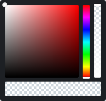
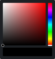 | 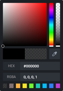 | 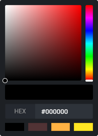 | |
|---|---|---|---|
| Equipment | Basic | Full | Only HEX with 4 colors |
| Properties | with-alpha with-initial-color with-eye-dropper with-hex-input with-rgb-input with-colors-history | with-hex-input :with-colors-history="4" | |
 | 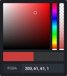 | 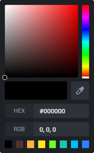 | |
| Equipment | Only alpha | RGBA with initial | All without alpha |
| Properties | with-alpha | with-alpha with-initial-color with-rgb-input | with-initial-color with-eye-dropper with-hex-input with-rgb-input with-colors-history |
Development
- Run
npm run dev:prepareto generate type stubs. - Use
npm run devto start playground in development mode.
Deploy
Deploy the application on the Edge with NuxtHub on your Cloudflare account:
npm run deploy
Then checkout your server logs, analaytics and more in the NuxtHub Admin.
You can also deploy using Cloudflare Pages CI.