# Introducing Nuxt Icon v1
> Discover Nuxt Icon v1 - a modern, versatile, and customizable icon solution for your Nuxt projects.
Icons are essential to modern web interfaces. They simplify navigation, clarify functionality, and enhance visual appeal. However, implementing icons efficiently involves challenges like scalability, dynamic loading, and server-side rendering (SSR) compatibility.
To address these challenges, we developed **Nuxt Icon v1** — a versatile, modern solution tailored for Nuxt projects. By building on established icon rendering techniques and introducing novel approaches, Nuxt Icon bridges the gap between performance, usability, and flexibility.
In this post, we’ll explore the challenges of icon rendering, the evolution of icon solutions, and how Nuxt Icon combines the best aspects of these methods to offer a seamless experience for developers.
---
## Why Are Icons Challenging?
At first glance, icons seem simple - they are essentially just tiny image elements that enhance a user interface, providing visual cues and enhancing usability.
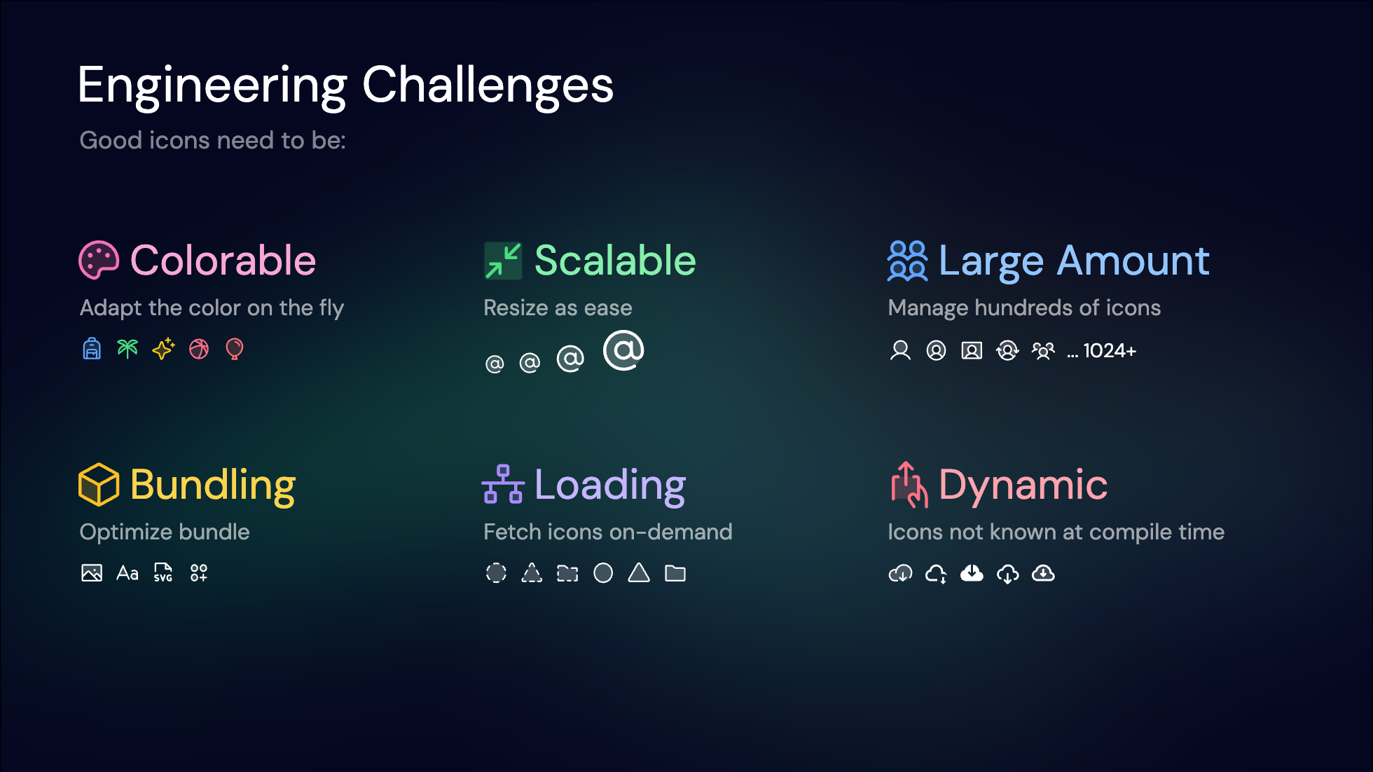
However, from an engineering perspective, they pose several challenges. Ideal icons should be:
- **Colorable**: Adaptable to themes and color schemes.
- **Scalable**: Render crisply at various sizes and resolutions.
- **Manageable**: Icon sets can contain hundreds or thousands of icons.
- **Efficiently Bundled**: Minimize network requests.
- **Optimally Loaded**: Affect application performance and user experience.
- **Dynamic**: Support dynamic loading for user-generated or runtime-defined icons.
Meeting all these needs requires a carefully engineered solution that balances trade-offs. Let’s explore the evolution of icon solutions and how they address these challenges.
---
## A Journey Through Icon Solutions
Over the years, developers have experimented with various techniques to render icons efficiently. Let’s explore the evolution of these solutions and the challenges they faced.
### 1. `![]() ` Tags: The Early Days
The most straightforward solution: using the `
` Tags: The Early Days
The most straightforward solution: using the `![]() ` tag. This was the go-to method in the early days of the web.
You'd host your image assets and use an `
` tag. This was the go-to method in the early days of the web.
You'd host your image assets and use an `![]() ` tag to link to that image, specifying its width and height. It's simple, requires no setup or runtime dependencies, and works natively in browsers.
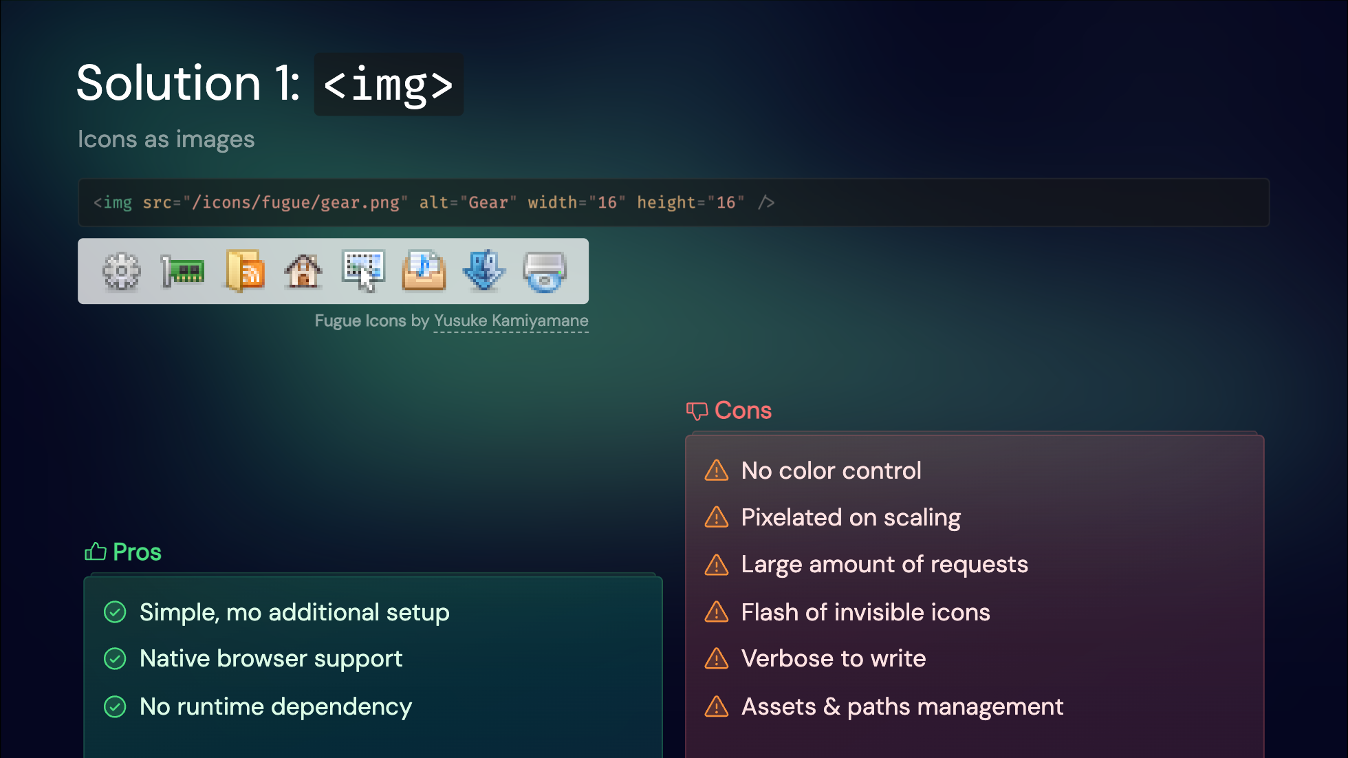
However, there are drawbacks. Images can become pixelated, lack color control, and don't scale well. Each icon being a separate image file results in many network requests, which could be slow, especially back in the days of HTTP 1.1. Before the image is downloaded, you might see a flash of invisible icons, which can hurt the user experience. Lastly, it's quite verbose to write, as you need to specify the full path of the image and manage the relative paths. It explains why this approach is rarely used on modern websites today.
---
### 2. Web Fonts: Icon Fonts
As the next step in icon evolution, web fonts emerged as a popular solution. Fonts are inherently vectorized and colorable, making them a natural fit for icons.
Iconset providers typically compile their icons into a special font file, assigning a unique Unicode character to each icon. This is accompanied by a CSS file that maps these Unicode values to specific icon classes.
The advantages of this approach are clear: it's easy to use, colorable, scalable, and requires only a single request to load all icons.
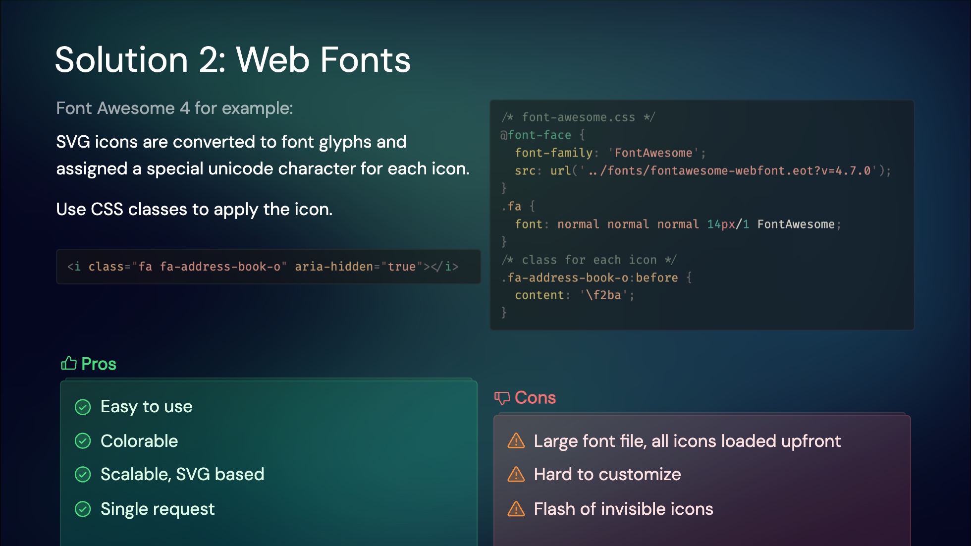
However, there are some downsides. Loading a large font file upfront can be slow, and customizing the icon set is challenging. Additionally, you might experience a flash of invisible icons before the font loads, as there are no fallback fonts available.
---
### 3. Inline SVGs: Component-Based Icons
With the advent of modern frontend frameworks, reusing HTML elements has become significantly easier. This led to the idea of directly inlining SVG tags as components.
To support this approach, many icon sets provide packages with wrappers tailored for each framework. For instance, MDI icons use a shared component and pass icon data as props, while Tabler icons offer a dedicated component for each icon.
Since these are SVGs, they are inherently colorable, scalable, and retain all the features of SVGs. Typically, icons are bundled into the app, eliminating additional network requests and ensuring they are SSR-friendly and visible on the first render.
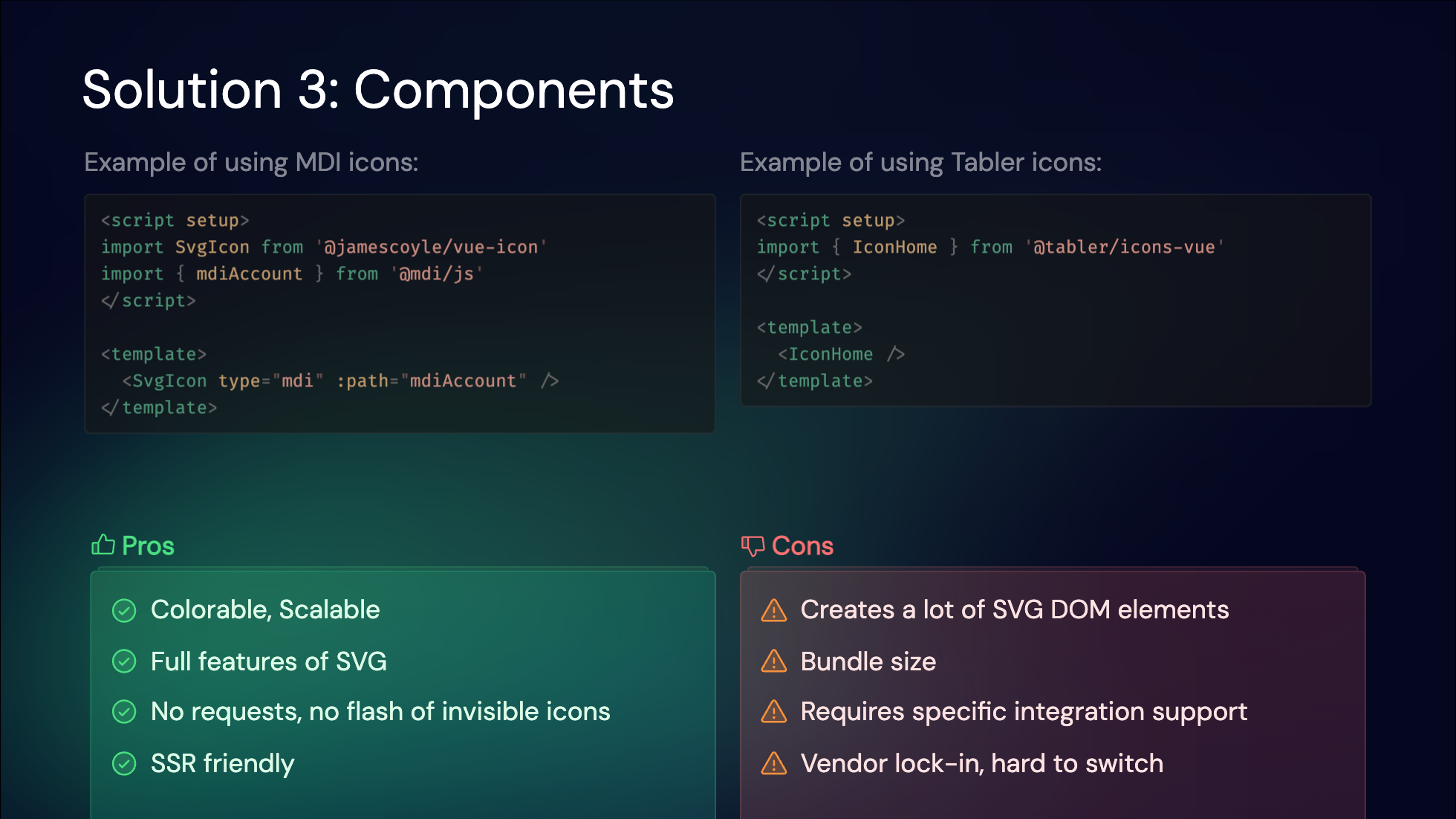
However, this method has its downsides. It generates numerous SVG DOM elements, which can impact performance when many icons are used. It also increases the bundle size and requires specific integration support for each icon set and framework combination, leading to a degree of vendor lock-in. This makes it challenging to switch to a different icon set or framework.
Despite these trade-offs, this approach is widely adopted today, as switching icon sets or frameworks is not a frequent necessity for most projects.
---
### 4. Iconify Runtime: Dynamic API Access
[Iconify](https://iconify.design/) revolutionized icon usage by aggregating over 200,000 icons across 100+ collections. Its runtime solution dynamically fetched icons via an API, enabling dynamic access to any icon without pre-bundling.
This is a great fit for rendering icons from user-provided content or other dynamic content that you don't know at build time. And it's super easy to set up, as you can even use it as a CDN without any build tools.
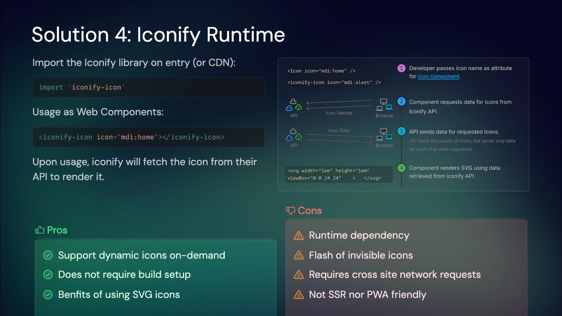
While this method offers great flexibility, it does come with some trade-offs. It introduces runtime dependencies, meaning icons will only render after JavaScript is loaded and the icon data is fetched. This approach also poses challenges for server-side rendering (SSR) and caching layers, such as those used in Progressive Web Apps (PWAs).
---
### 5. On-Demand Component Icons
With the unified interface from Iconify and Vite's on-demand approach, we developed [`unplugin-icons`](https://github.com/unplugin/unplugin-icons). This tool allows you to import any icons as components on-demand.
As an [`unplugin`](https://github.com/unjs/unplugin), it supports all popular build tools, including Vite, webpack, and rspack. We provide compilers for popular frameworks like Vue, React, Svelte, and Solid. With Iconify, you can use any icon across any framework, minimizing vendor lock-in.
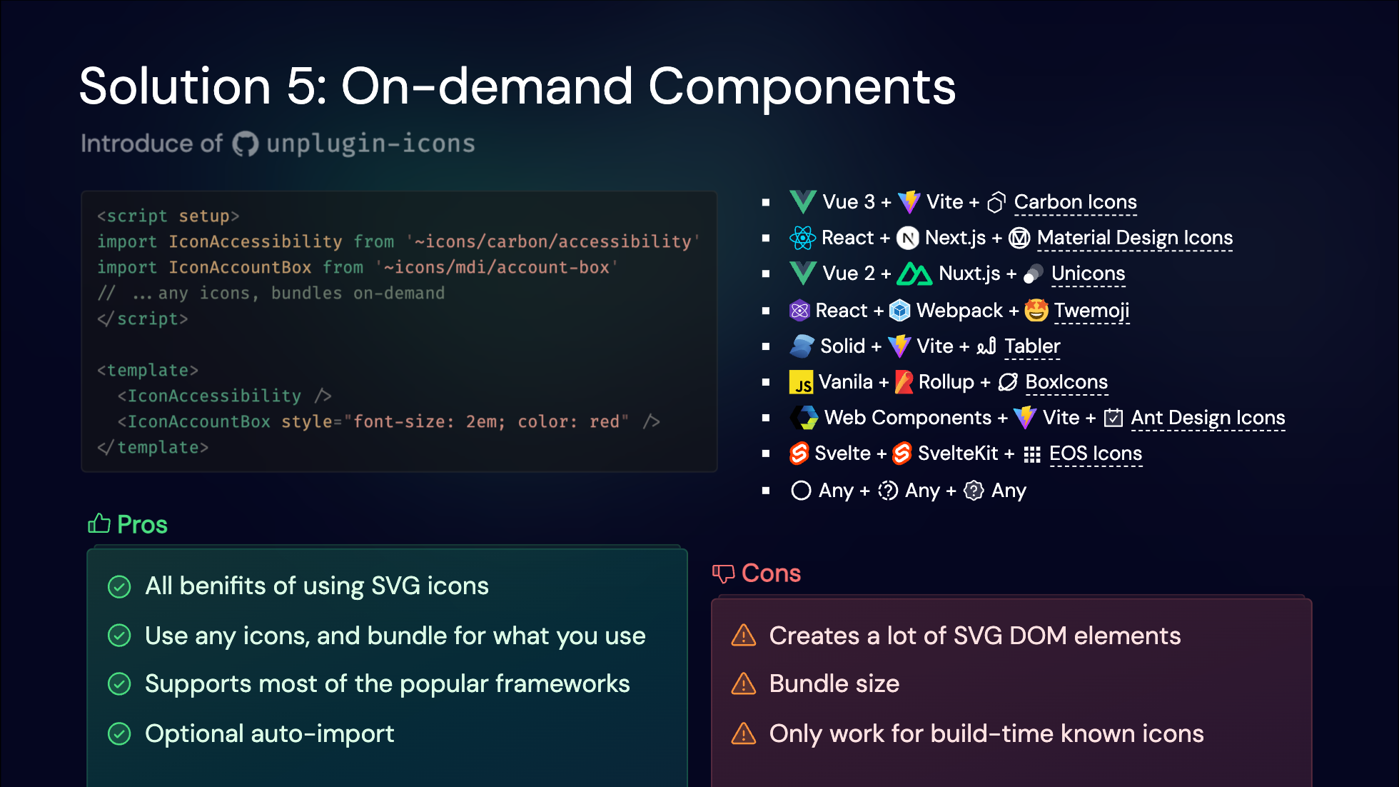
While this technique shares the same pros and cons as previous component icon solutions, the integration with build tools allows us to serve the full Iconify collection while only shipping the icons you actually use. However, runtime concerns like DOM element management still persist.
---
### 6. Pure CSS Icons
As a side-effect of working on [UnoCSS](https://unocss.dev/), we discovered the potential of embedding icons entirely in CSS, leading to the innovative solution of [Pure CSS Icons](https://antfu.me/posts/icons-in-pure-css).
This method involves inlining SVG icons as data URLs and providing a single class to display the icons. With some tweaks, these icons become colorable, scalable, and even capable of displaying SVG animations.
Browsers can cache the CSS rules, and each icon requires only **one DOM element** to render. This approach ships the icons in a single CSS file with no additional requests. Since it's pure CSS, the icons display along with the rest of your UI, require zero runtime, and work naturally with SSR—your server doesn't need any extra work on the server side.
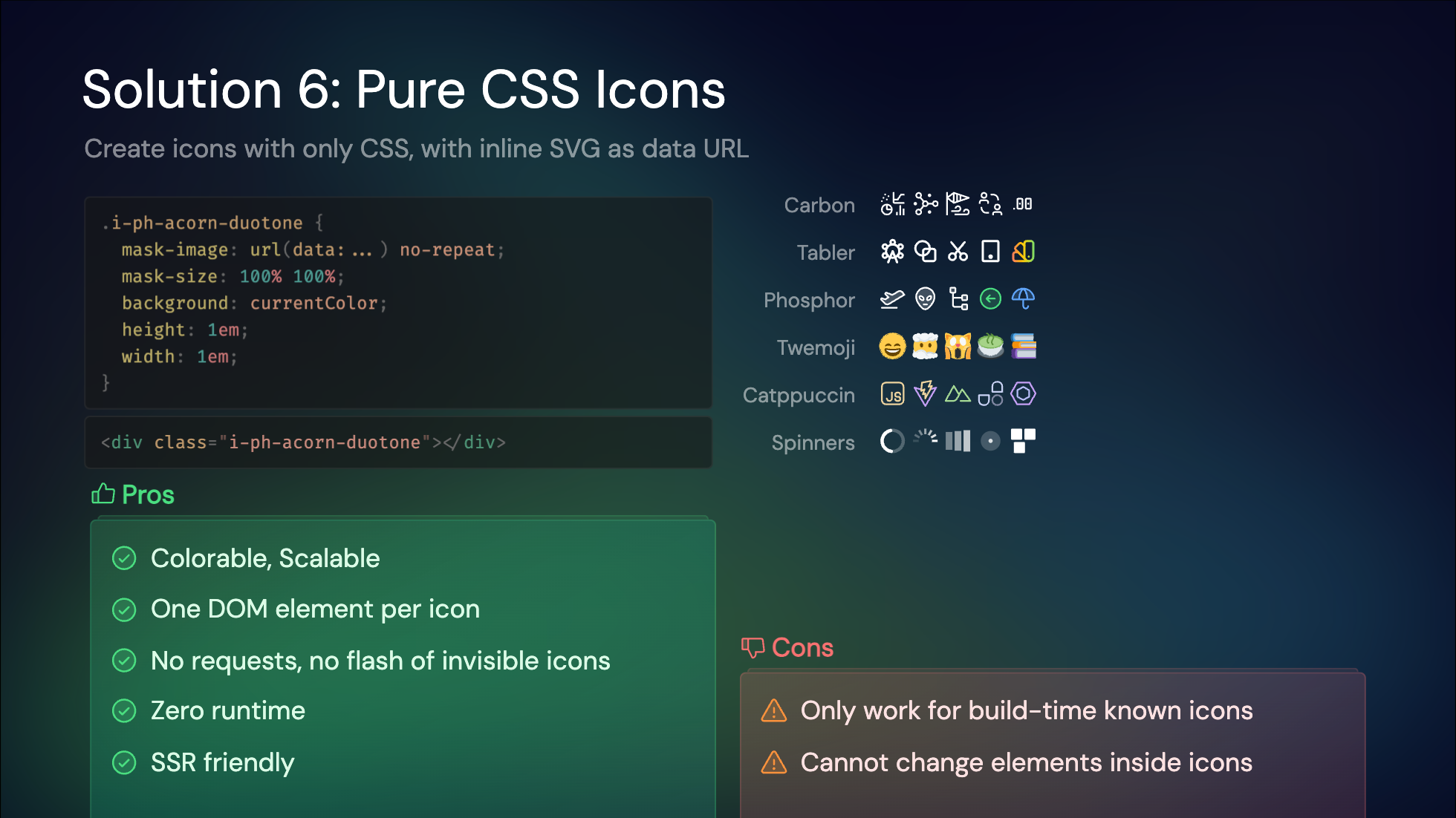
The only downsides are the lack of full customization for elements inside the SVG and the need to bundle icons at build-time, which isn't dynamic.
---
## The Challenges to Integrate in Nuxt
While I would say that the [Pure CSS Icons](#_6-pure-css-icons) and [On-demand Component Icons](#_5-on-demand-component-icons) would be pretty sufficient for most of the static usages, Nuxt as a full featured framework, has a bit more requirements to integrate icons efficiently:
- **SSR/CSR**: Nuxt works in both server-side rendering (SSR) and client-side rendering (CSR) modes. We care a lot about the end user experience, and we want to ensure that icons are rendered instantly without flickers.
- **Dynamic Icons**: In integrations like [Nuxt Content](https://content.nuxt.com/), the content can be provided at runtime or from external sources, which we are not aware at build time. We want to ensure we have the capability to integrate with those cases well.
- **Performance**: We want to ensure that the icons are bundled efficiently, and the loading of icons is optimized for the best performance.
- **Custom Icons**: While Iconify provides a wide range of icons for selection, we also aware it's pretty common for projects to have their own icon sets, or wanted to use paid icons that are not available in Iconify. Supporting custom icons is crucial for our users.
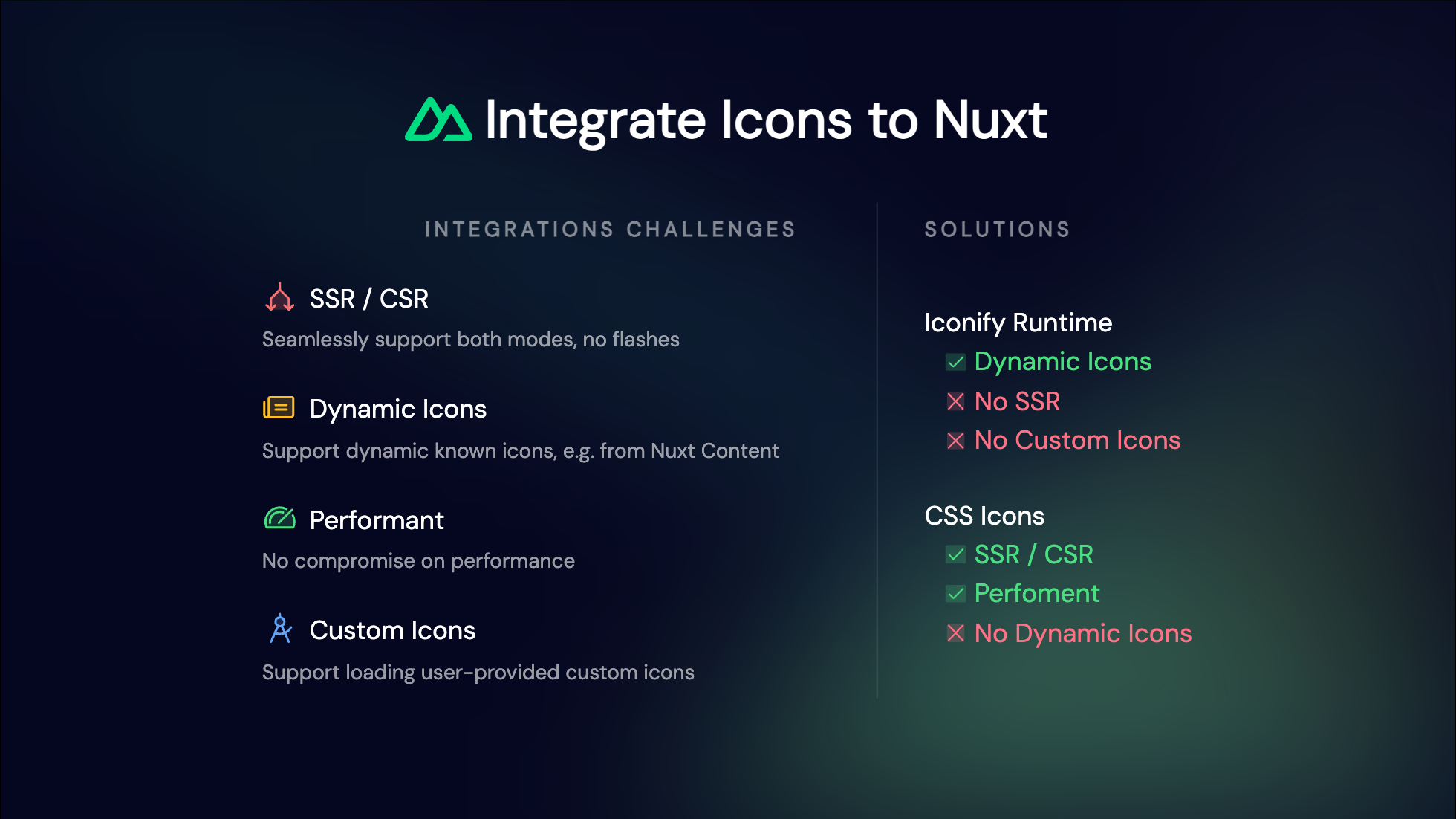
With these requirements in mind, let's revisit the solutions we discussed earlier and see how they stack up.
For dynamic icons, the Iconify Runtime stands out as a viable option. It allows for dynamic fetching of icons, making it suitable for content that isn't known at build time. However, it has its drawbacks. The reliance on runtime dependencies means it doesn't integrate seamlessly with SSR, and it doesn't support custom icons since the requests are directed to Iconify's servers, which don't have access to our local icon setup.
Conversely, Pure CSS Icons offer excellent performance and SSR compatibility. They ensure icons are rendered instantly without flickers and are bundled efficiently. However, they fall short when it comes to dynamic icons, as they need to be bundled at build time and lack the flexibility to adapt to runtime content changes.
Balancing these trade-offs is indeed challenging. So, why not leverage the strengths of both approaches? By understanding these trade-offs, we can better appreciate the balanced solution that Nuxt Icon v1 offers.
---
## Introducing Nuxt Icon v1: The Balance of Both Worlds
With the flexibility of the Nuxt Module system, Nuxt Icon combines the best of both worlds: the instant rendering of CSS icons and the dynamic fetching of Iconify icons. This dual approach provides a versatile, modern, and customizable icon solution that seamlessly adapts to your project's needs.
### Dual Rendering Modes
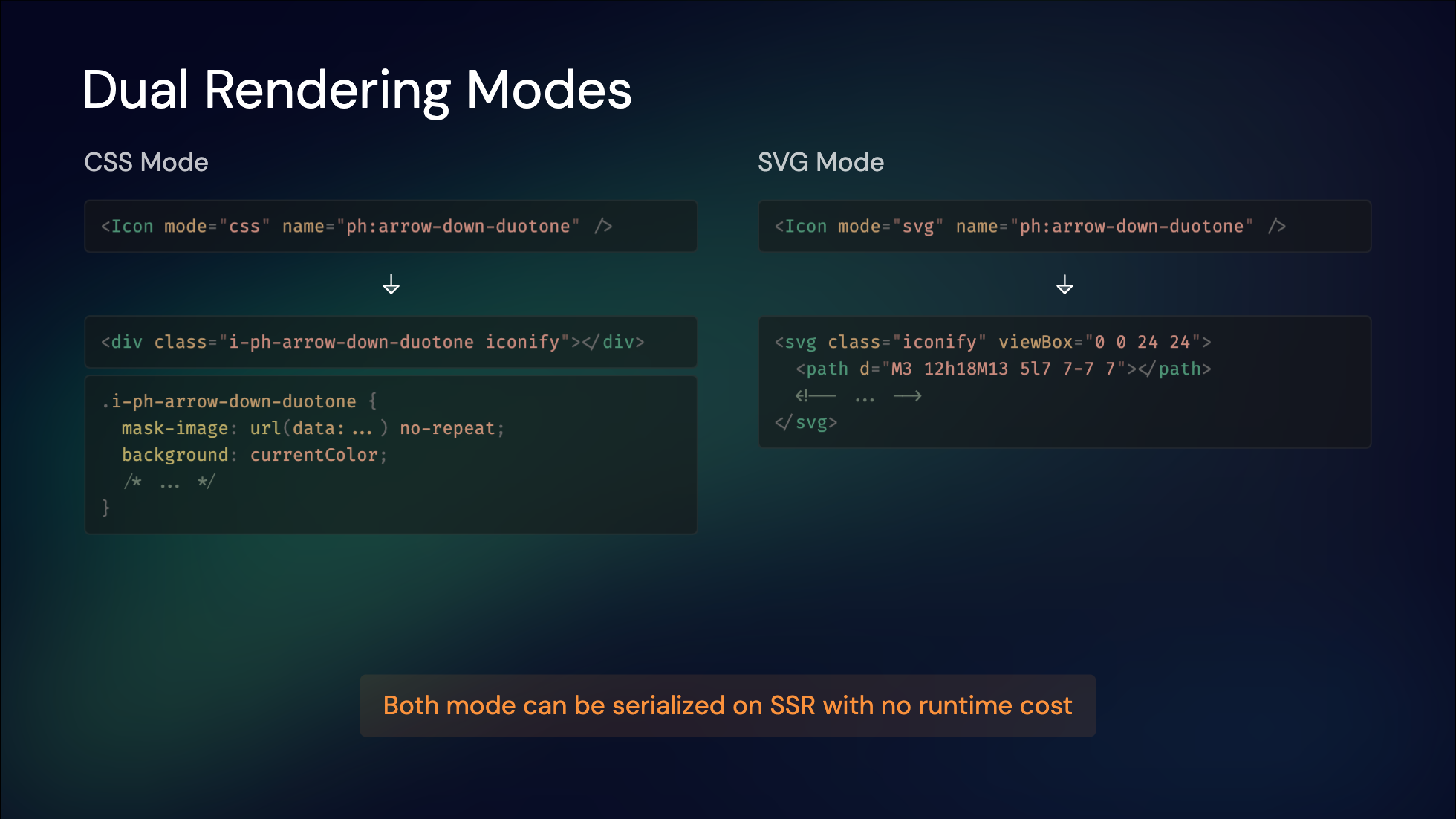
To address the trade-offs in rendering approaches, Nuxt Icon introduces a versatile `` component that supports both CSS and SVG modes, both of which are SSR-friendly. Depending on your customization needs, you can switch between these modes for each icon.
In CSS mode, icons are included in the CSS during SSR, ensuring they render instantly without any runtime cost. In SVG mode, icons are inlined as HTML during SSR, providing the same immediate rendering benefits. Both approaches ensure that icons appear on the initial screen without any delay, offering a seamless user experience.
---
### Icon Bundles
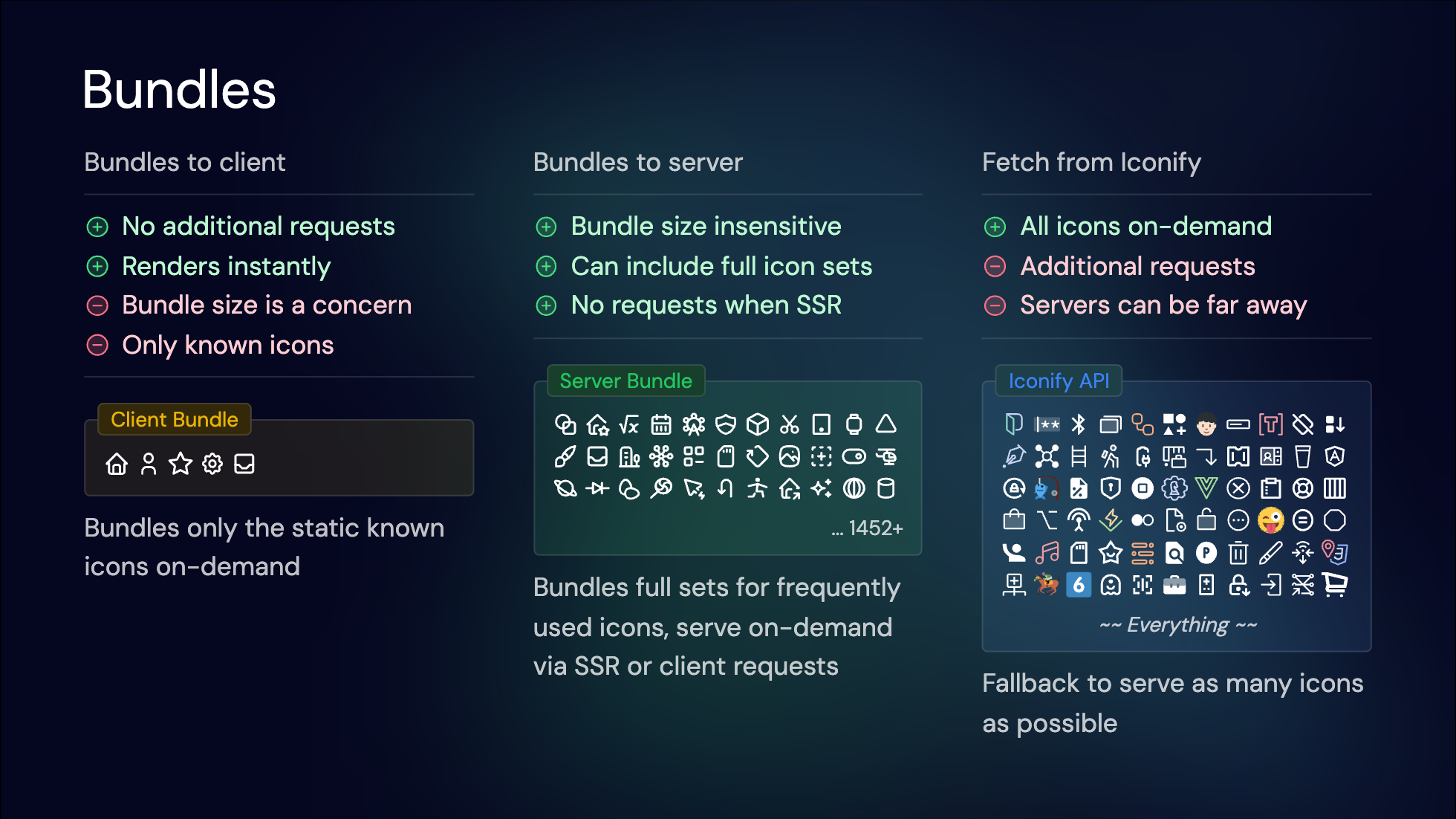
Dynamic icons present unique challenges, especially when it comes to loading them efficiently. To address this, we leverage Iconify's API, which allows us to serve any icon on demand via network requests. However, relying solely on this API can introduce delays, especially if the servers are geographically distant from your users.
To mitigate this, we introduced the concept of Icon Bundles. We can bundle frequently used icons directly into the `Client Bundle`. This ensures that these icons render instantly without additional network requests. However, bundling all possible icons isn't feasible due to the potential increase in bundle size.
Given that Nuxt is a full-stack framework, we can strike a balance by introducing a `Server Bundle`. On the server side, bundle size is less of an issue, allowing us to include a more extensive set of icons. During SSR, these icons can be fetched quickly and sent to the client as needed. This setup ensures high performance for commonly used icons while still providing the flexibility to serve any icon from Iconify as a fallback.
By combining client-side bundling for static icons and server-side bundling for dynamic icons, we achieve an optimal balance between performance and flexibility.
---
### Data Flow
Here is a data flow diagram illustrating how Nuxt Icon requests icon data:
1. You use the `` component and provide the icon `name`.
2. Nuxt Icon will first check if the icon is available in the `Client Bundle`, or the SSR payload (icons that are known at SSR will be presented in the payload). If so, the icon will be rendered instantly.
3. If the icon is not available on the client side, Nuxt Icon will fetch the icon data from the server API shipped along with your Nuxt app. Inside the server endpoint, it will query from the `Server Bundle` to see if the icon is available.
4. Between that, there are multiple cache systems involved. Server endpoint cache, HTTP cache, and client-side cache to ensure the icon is fetched efficiently and quickly. Since icon data does not change frequently, we use hard cache strategies to ensure the best performance.
5. When the icon is unknown to both the client and server (dynamic icons), the server endpoint will fallback to the Iconify API to fetch the icon data. Since the server endpoint is cached, the Iconify API will be called only once for each unique icon regardless of how many clients are requesting it, to save resources on both sides.
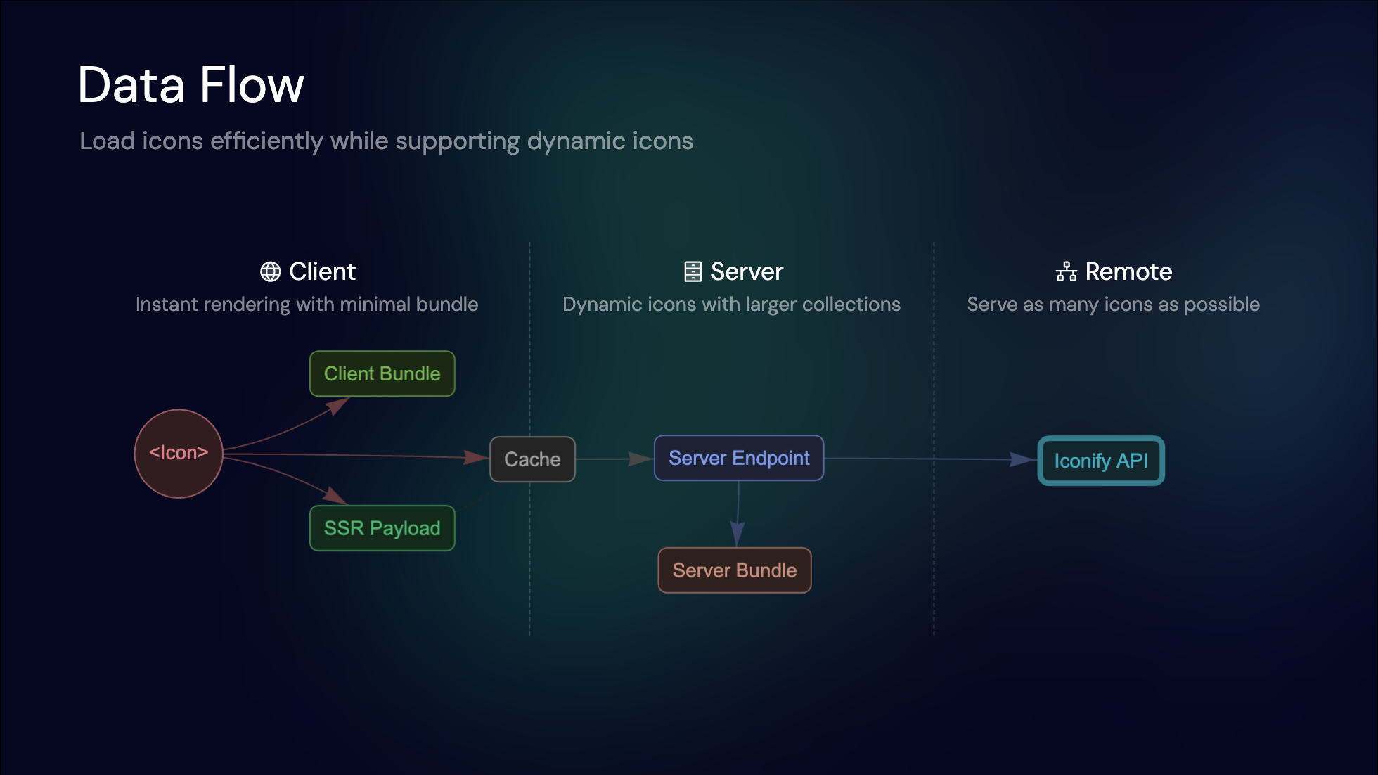
This layered approach ensures efficient icon delivery, balancing speed and flexibility, while being as dynamic as possible. And balance out the trade-offs between each solution.
---
## Try Nuxt Icon Today
Nuxt Icon v1 represents the culmination of years of innovation in icon rendering. Whether you’re building a dynamic app, a static website, or anything in between, Nuxt Icon adapts to your needs.
It’s easy to add Nuxt Icon to your project by running the following command:
```bash
npx nuxi module add icon
```
Then, import the `` component in your Vue components, providing icon `name` following [Iconify's conventions](https://iconify.design/docs/icons/icon-basics.html):
```vue
```
Explore more with the [documentation](https://github.com/nuxt/icon), experiment with its features, and let us know your thoughts. We’re excited to see how Nuxt Icon transforms your projects!
**Happy Nuxting ✨**
` tag to link to that image, specifying its width and height. It's simple, requires no setup or runtime dependencies, and works natively in browsers.

However, there are drawbacks. Images can become pixelated, lack color control, and don't scale well. Each icon being a separate image file results in many network requests, which could be slow, especially back in the days of HTTP 1.1. Before the image is downloaded, you might see a flash of invisible icons, which can hurt the user experience. Lastly, it's quite verbose to write, as you need to specify the full path of the image and manage the relative paths. It explains why this approach is rarely used on modern websites today.
---
### 2. Web Fonts: Icon Fonts
As the next step in icon evolution, web fonts emerged as a popular solution. Fonts are inherently vectorized and colorable, making them a natural fit for icons.
Iconset providers typically compile their icons into a special font file, assigning a unique Unicode character to each icon. This is accompanied by a CSS file that maps these Unicode values to specific icon classes.
The advantages of this approach are clear: it's easy to use, colorable, scalable, and requires only a single request to load all icons.

However, there are some downsides. Loading a large font file upfront can be slow, and customizing the icon set is challenging. Additionally, you might experience a flash of invisible icons before the font loads, as there are no fallback fonts available.
---
### 3. Inline SVGs: Component-Based Icons
With the advent of modern frontend frameworks, reusing HTML elements has become significantly easier. This led to the idea of directly inlining SVG tags as components.
To support this approach, many icon sets provide packages with wrappers tailored for each framework. For instance, MDI icons use a shared component and pass icon data as props, while Tabler icons offer a dedicated component for each icon.
Since these are SVGs, they are inherently colorable, scalable, and retain all the features of SVGs. Typically, icons are bundled into the app, eliminating additional network requests and ensuring they are SSR-friendly and visible on the first render.

However, this method has its downsides. It generates numerous SVG DOM elements, which can impact performance when many icons are used. It also increases the bundle size and requires specific integration support for each icon set and framework combination, leading to a degree of vendor lock-in. This makes it challenging to switch to a different icon set or framework.
Despite these trade-offs, this approach is widely adopted today, as switching icon sets or frameworks is not a frequent necessity for most projects.
---
### 4. Iconify Runtime: Dynamic API Access
[Iconify](https://iconify.design/) revolutionized icon usage by aggregating over 200,000 icons across 100+ collections. Its runtime solution dynamically fetched icons via an API, enabling dynamic access to any icon without pre-bundling.
This is a great fit for rendering icons from user-provided content or other dynamic content that you don't know at build time. And it's super easy to set up, as you can even use it as a CDN without any build tools.

While this method offers great flexibility, it does come with some trade-offs. It introduces runtime dependencies, meaning icons will only render after JavaScript is loaded and the icon data is fetched. This approach also poses challenges for server-side rendering (SSR) and caching layers, such as those used in Progressive Web Apps (PWAs).
---
### 5. On-Demand Component Icons
With the unified interface from Iconify and Vite's on-demand approach, we developed [`unplugin-icons`](https://github.com/unplugin/unplugin-icons). This tool allows you to import any icons as components on-demand.
As an [`unplugin`](https://github.com/unjs/unplugin), it supports all popular build tools, including Vite, webpack, and rspack. We provide compilers for popular frameworks like Vue, React, Svelte, and Solid. With Iconify, you can use any icon across any framework, minimizing vendor lock-in.

While this technique shares the same pros and cons as previous component icon solutions, the integration with build tools allows us to serve the full Iconify collection while only shipping the icons you actually use. However, runtime concerns like DOM element management still persist.
---
### 6. Pure CSS Icons
As a side-effect of working on [UnoCSS](https://unocss.dev/), we discovered the potential of embedding icons entirely in CSS, leading to the innovative solution of [Pure CSS Icons](https://antfu.me/posts/icons-in-pure-css).
This method involves inlining SVG icons as data URLs and providing a single class to display the icons. With some tweaks, these icons become colorable, scalable, and even capable of displaying SVG animations.
Browsers can cache the CSS rules, and each icon requires only **one DOM element** to render. This approach ships the icons in a single CSS file with no additional requests. Since it's pure CSS, the icons display along with the rest of your UI, require zero runtime, and work naturally with SSR—your server doesn't need any extra work on the server side.

The only downsides are the lack of full customization for elements inside the SVG and the need to bundle icons at build-time, which isn't dynamic.
---
## The Challenges to Integrate in Nuxt
While I would say that the [Pure CSS Icons](#_6-pure-css-icons) and [On-demand Component Icons](#_5-on-demand-component-icons) would be pretty sufficient for most of the static usages, Nuxt as a full featured framework, has a bit more requirements to integrate icons efficiently:
- **SSR/CSR**: Nuxt works in both server-side rendering (SSR) and client-side rendering (CSR) modes. We care a lot about the end user experience, and we want to ensure that icons are rendered instantly without flickers.
- **Dynamic Icons**: In integrations like [Nuxt Content](https://content.nuxt.com/), the content can be provided at runtime or from external sources, which we are not aware at build time. We want to ensure we have the capability to integrate with those cases well.
- **Performance**: We want to ensure that the icons are bundled efficiently, and the loading of icons is optimized for the best performance.
- **Custom Icons**: While Iconify provides a wide range of icons for selection, we also aware it's pretty common for projects to have their own icon sets, or wanted to use paid icons that are not available in Iconify. Supporting custom icons is crucial for our users.

With these requirements in mind, let's revisit the solutions we discussed earlier and see how they stack up.
For dynamic icons, the Iconify Runtime stands out as a viable option. It allows for dynamic fetching of icons, making it suitable for content that isn't known at build time. However, it has its drawbacks. The reliance on runtime dependencies means it doesn't integrate seamlessly with SSR, and it doesn't support custom icons since the requests are directed to Iconify's servers, which don't have access to our local icon setup.
Conversely, Pure CSS Icons offer excellent performance and SSR compatibility. They ensure icons are rendered instantly without flickers and are bundled efficiently. However, they fall short when it comes to dynamic icons, as they need to be bundled at build time and lack the flexibility to adapt to runtime content changes.
Balancing these trade-offs is indeed challenging. So, why not leverage the strengths of both approaches? By understanding these trade-offs, we can better appreciate the balanced solution that Nuxt Icon v1 offers.
---
## Introducing Nuxt Icon v1: The Balance of Both Worlds
With the flexibility of the Nuxt Module system, Nuxt Icon combines the best of both worlds: the instant rendering of CSS icons and the dynamic fetching of Iconify icons. This dual approach provides a versatile, modern, and customizable icon solution that seamlessly adapts to your project's needs.
### Dual Rendering Modes
To address the trade-offs in rendering approaches, Nuxt Icon introduces a versatile `` component that supports both CSS and SVG modes, both of which are SSR-friendly. Depending on your customization needs, you can switch between these modes for each icon.
In CSS mode, icons are included in the CSS during SSR, ensuring they render instantly without any runtime cost. In SVG mode, icons are inlined as HTML during SSR, providing the same immediate rendering benefits. Both approaches ensure that icons appear on the initial screen without any delay, offering a seamless user experience.

---
### Icon Bundles
Dynamic icons present unique challenges, especially when it comes to loading them efficiently. To address this, we leverage Iconify's API, which allows us to serve any icon on demand via network requests. However, relying solely on this API can introduce delays, especially if the servers are geographically distant from your users.
To mitigate this, we introduced the concept of Icon Bundles. We can bundle frequently used icons directly into the `Client Bundle`. This ensures that these icons render instantly without additional network requests. However, bundling all possible icons isn't feasible due to the potential increase in bundle size.
Given that Nuxt is a full-stack framework, we can strike a balance by introducing a `Server Bundle`. On the server side, bundle size is less of an issue, allowing us to include a more extensive set of icons. During SSR, these icons can be fetched quickly and sent to the client as needed. This setup ensures high performance for commonly used icons while still providing the flexibility to serve any icon from Iconify as a fallback.
By combining client-side bundling for static icons and server-side bundling for dynamic icons, we achieve an optimal balance between performance and flexibility.

---
### Data Flow
Here is a data flow diagram illustrating how Nuxt Icon requests icon data:
1. You use the `` component and provide the icon `name`.
2. Nuxt Icon will first check if the icon is available in the `Client Bundle`, or the SSR payload (icons that are known at SSR will be presented in the payload). If so, the icon will be rendered instantly.
3. If the icon is not available on the client side, Nuxt Icon will fetch the icon data from the server API shipped along with your Nuxt app. Inside the server endpoint, it will query from the `Server Bundle` to see if the icon is available.
4. Between that, there are multiple cache systems involved. Server endpoint cache, HTTP cache, and client-side cache to ensure the icon is fetched efficiently and quickly. Since icon data does not change frequently, we use hard cache strategies to ensure the best performance.
5. When the icon is unknown to both the client and server (dynamic icons), the server endpoint will fallback to the Iconify API to fetch the icon data. Since the server endpoint is cached, the Iconify API will be called only once for each unique icon regardless of how many clients are requesting it, to save resources on both sides.

This layered approach ensures efficient icon delivery, balancing speed and flexibility, while being as dynamic as possible. And balance out the trade-offs between each solution.
---
## Try Nuxt Icon Today
Nuxt Icon v1 represents the culmination of years of innovation in icon rendering. Whether you’re building a dynamic app, a static website, or anything in between, Nuxt Icon adapts to your needs.
It’s easy to add Nuxt Icon to your project by running the following command:
```bash
npx nuxi module add icon
```
Then, import the `` component in your Vue components, providing icon `name` following [Iconify's conventions](https://iconify.design/docs/icons/icon-basics.html):
```vue
```
Explore more with the [documentation](https://github.com/nuxt/icon), experiment with its features, and let us know your thoughts. We’re excited to see how Nuxt Icon transforms your projects!
**Happy Nuxting ✨**